Kibana Dashboards
Kibana is a tool that enables Electrum and Electrum’s clients to view the overall health of all services for each client.
Each client has their own dedicated set of Kibana dashboards covering the full range of Electrum services that the client has integrated with. The dashboards consist of graphs to provide you with an overall view of the services. You can also use Kibana to:
- See the success and failure rate of a service.
- Filter transactions based on services, specific service providers, error messages, date and time.
- View how many transactions are failing with a specific error message.
- See if a transaction is stuck in a store-and-forward queue.
Access Your Kibana Dashboards
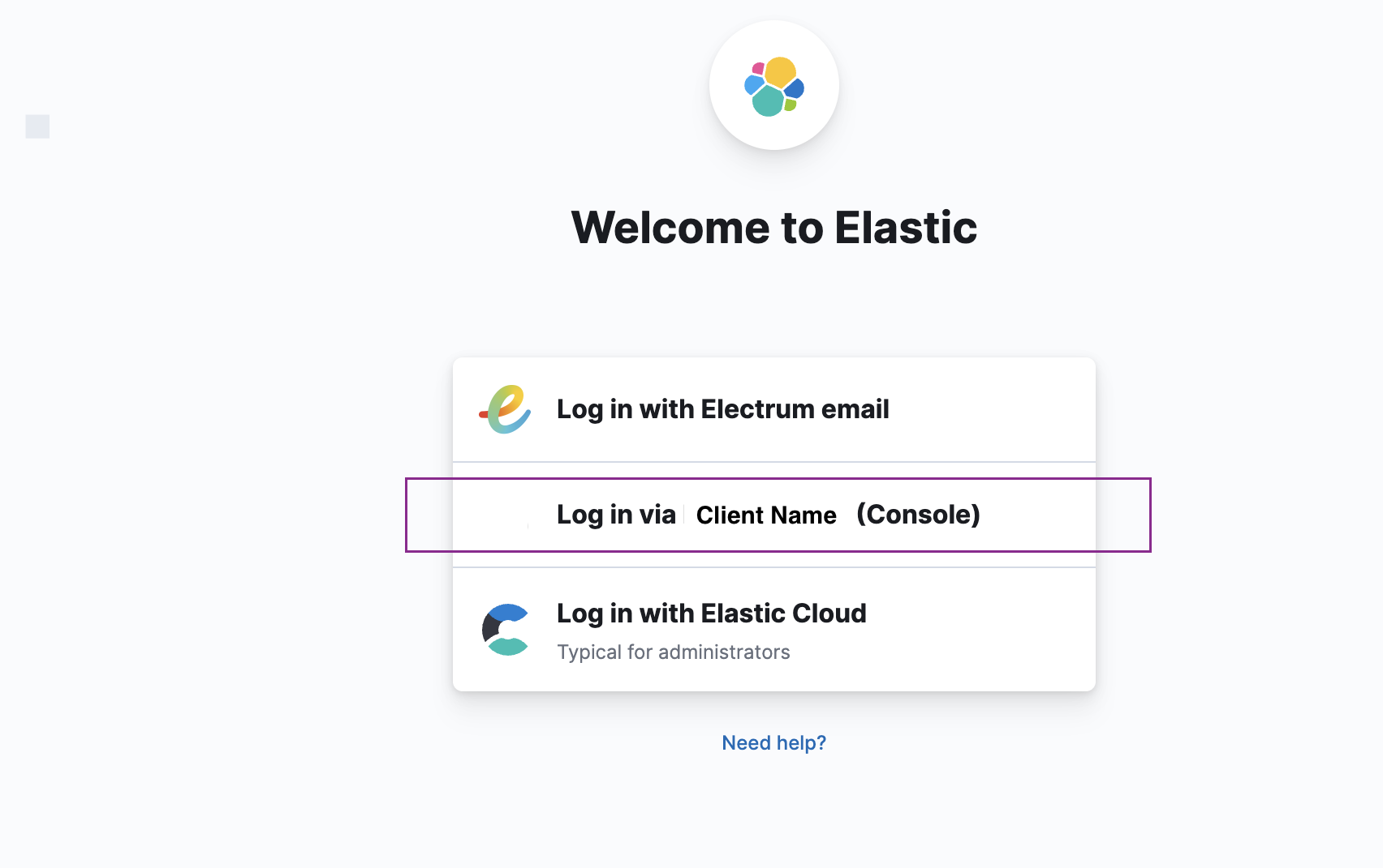
You will have been given the Kibana URL during onboarding. You can access Kibana directly from the login page using the Console login option.
If you are not able to log in, then contact Electrum Support. They will check that you have access to Kibana and grant you access if necessary.
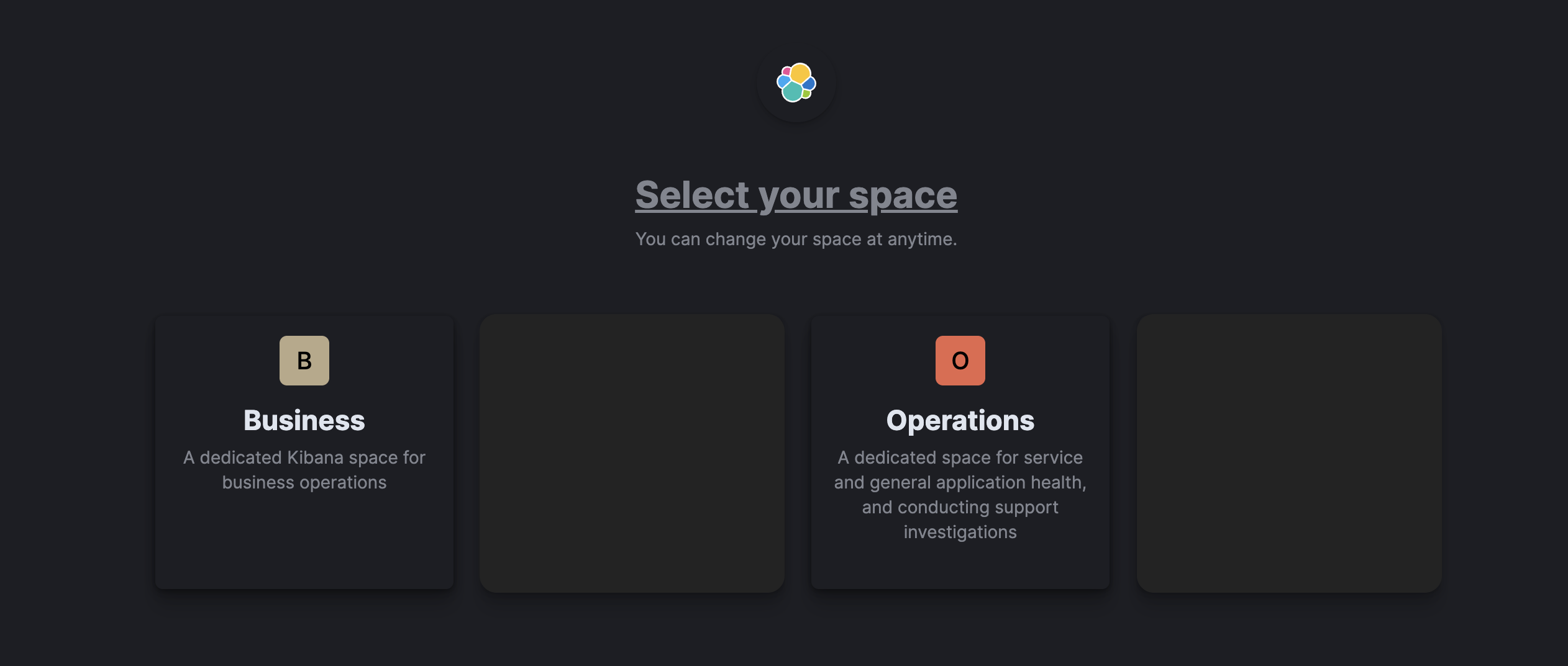
You will be directed to a page similar to the one below. Select the Operations space.
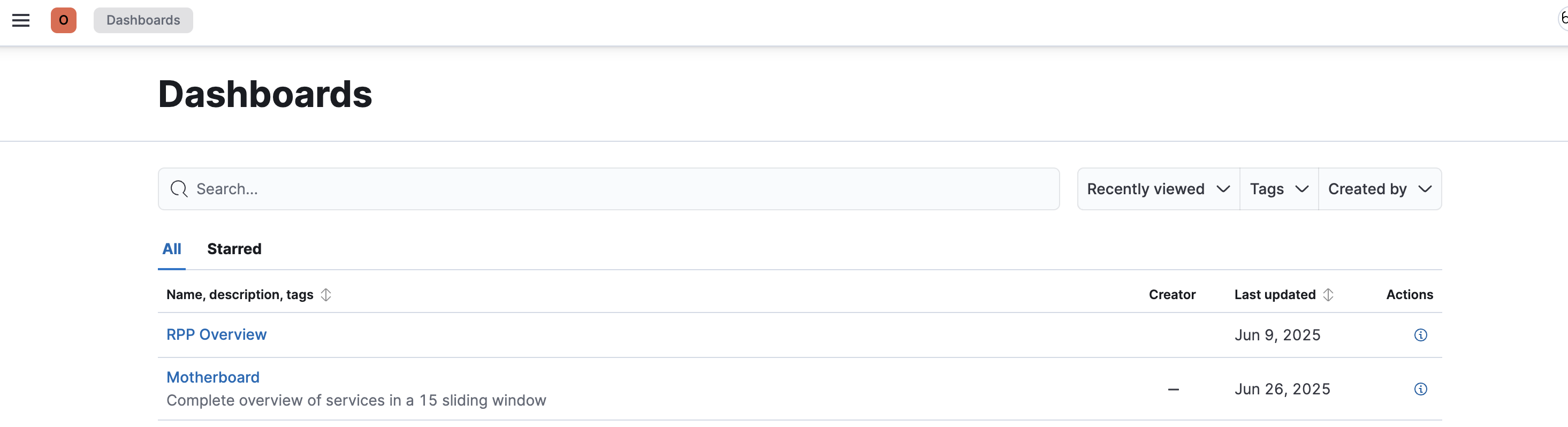
You will see a list of available dashboards, based on which services you have set up with Electrum and which dashboards Electrum has made available to you. Click on one (e.g., RPP Overview) to view.
Interpret Your Dashboard
The images below show the type of information you could expect to see on the RPP Overview dashboard.
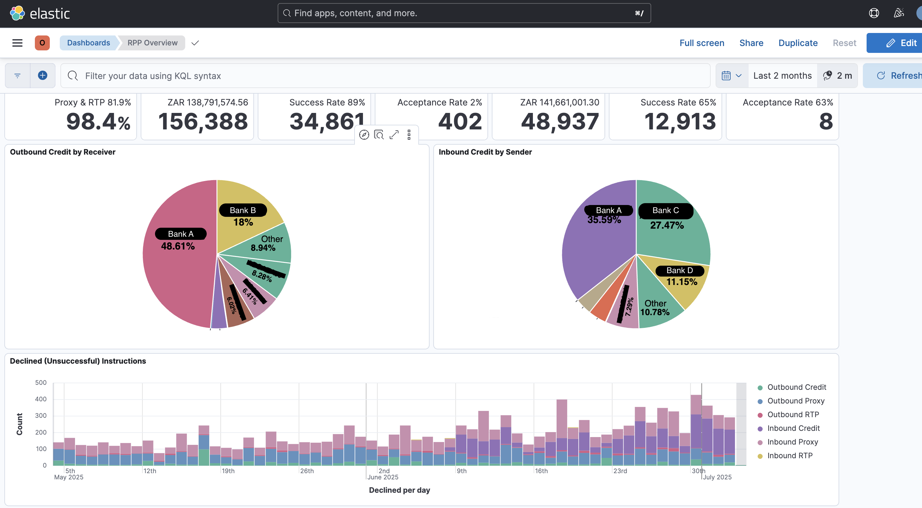
The pie charts provide a visual representation showing the transaction volumes for inbound and outbound credits, split by industry bank.
The first tile at the top of the screen shows, in bold, the percentage of RPP (PayShap) transactions that were successfully processed and approved within the specified time frame (in this case, 98.4% over the past two months). However, the proxy and RTP sub-set shows a lower success rate at 81.9%.
The other tiles show the total number of transactions per transaction type within a specified time frame as well as other information, for example:
- The success rate over the total number transactions.
- The total monetary value represented by those transactions.
The graph at the bottom of the screen shows the number of declined, or unsuccessful, transactions over a specified time period.
Investigate Trends and Transactions in Kibana
Investigate Trends and Success/Failure Over a Time Period
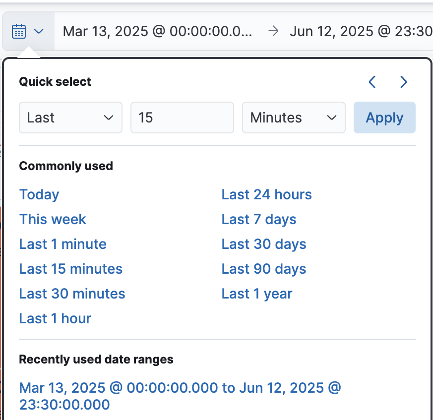
To view transaction volumes and success or failure rates during a specific time period, click on the calendar icon at the top of your screen. You will have the option to either:
- ‘Quick select’ a time range ending in the current day and time.
- Input a specific date and time range.
Then, click ‘Apply’
The charts will update to show data only from the time frame you have chosen.